
Recently, after a long day of collaborating, I was talking to colleagues and a client at a global e-commerce platform. In our conversation, we touched upon the topic of 'Designing for other cultures'. Somehow, this insightful discussion stayed with me in the time following that conversation. I had never actually come across a manual or instruction on designing for a culture other than your own. I decided to start collecting information. In this article, I will share my key insights on the subject.
Cross-cultural design is a complex topic, focusing on how design can be shaped and influenced by cultures and their nuances. This can be, for example, by matching and adapting design elements such as graphics, colour and layout to support the specific needs of customers and businesses within a cultural context.
In (digital) design, many still fall into the trap of assuming that users all come from a WEIRD (Westernised, Educated, Industrialised, Rich, Developed) country. While in fact, only 15% of the world's population is a part of this. That means there is a pretty good chance that the user of your services is actually not from such a WEIRD country.
Assumptions can, fortunately, be fought with knowledge, and hopefully, you will benefit from the knowledge I am going to share below. Before I do so, let me ask you to imagine this specific person as a user: 'a 42-year-old digital marketing manager with two children'. I will come back to this later.
White space and text direction
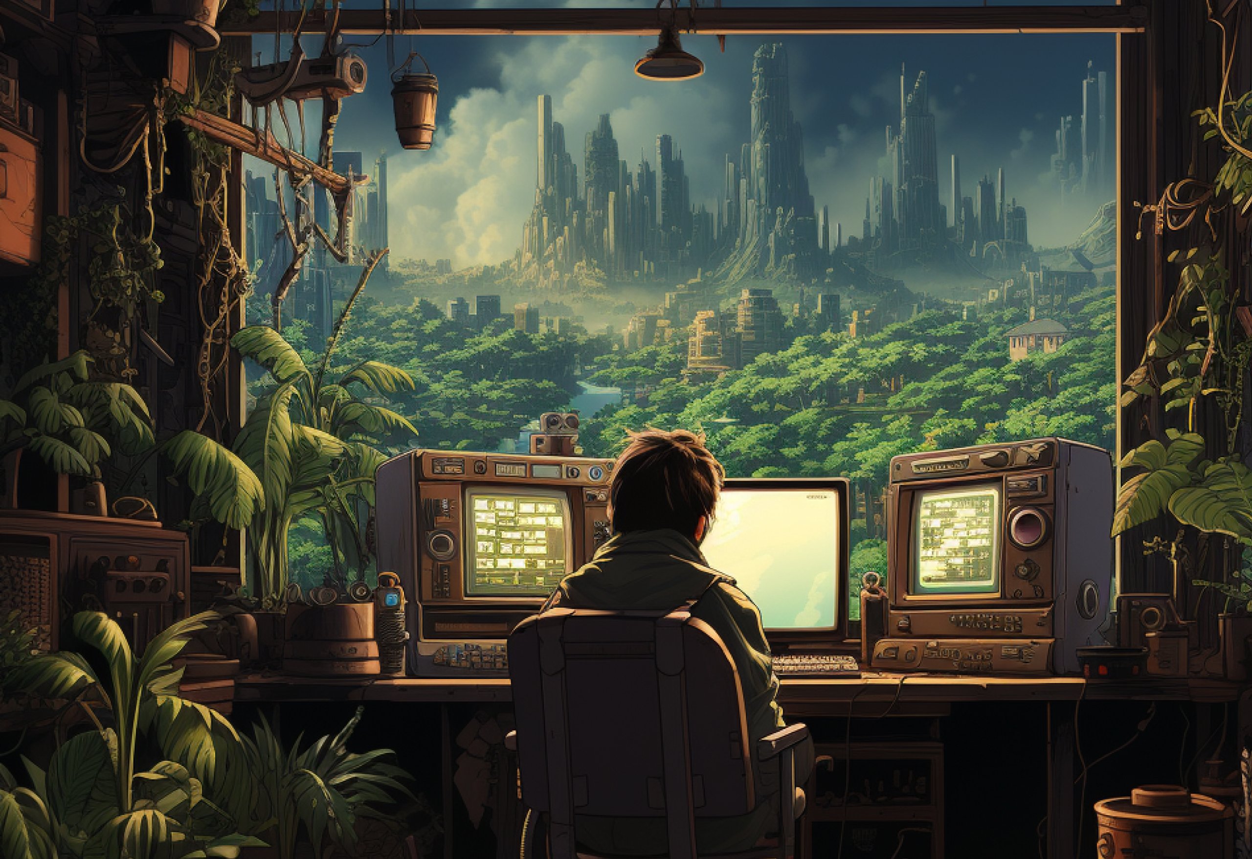
To this day, Western design is still strongly influenced by the Bauhaus movement which focuses on functionality: lots of white space, clean lines and few frills. This is diametrically (no pun intended) opposed to what is considered aesthetic in Asian countries, such as Japan, for example. If we consider one of the most popular websites there such as Rakuten, we see that the page has little white space and a high information density.

Rakuten and Amazon (Japanese website on the left, Amazon, especially popular in America, on the right)
Text direction also determines the interface. In many countries, people write from left to right, but in Hebrew, for example, this is not the case as people write from right to left. This means that the interface must also follow this direction, and is therefore reversed from what we are used to. Some elements that are not reversed are icons that do not 'indicate direction', for example the icon for a camera. Icons and elements that do indicate direction are, for example, a clock, a phone and graphs.
Iconography
The meaning of icons should be self-explanatory, so that people understand what is meant by them and the interface is (hopefully) clearer and more transparent as a result. However, not all icons are so self-evident, even the ones you figured could not possibly be misinterpreted. Take the search icon, for example. After surveying customers in India, Amazon discovered that some users thought the search icon of a magnifying glass was actually a ping-pong paddle. This makes total sense, as table tennis is one of the most popular sports in that country, along with cricket. Besides the fact that icons can be interpreted differently, icons and their meanings can also age. Examples that everyone is familiar with include the floppy disk, used to denote storage, and the old telephone handset in the Whatsapp logo.
Of course, it is not that these icons can no longer be used; they have gained high recognition by now. However, be aware that visual metaphors can work differently for different ages, cultures and languages.

Use of images
We all know the stock images with smiling white people. They always have the most incredible fun, at the office, in a home situation or while going out. However, a large part of the population will be unable to identify with them. After all, what if you are in a wheelchair and disabled, have a different nationality, skin colour or sexuality? Or maybe certain things are visible in the image that are taboo, such as using the left hand to indicate things in Nigeria. Thus, always make sure you use inclusive imagery and try to research important cultural markers before you start designing.
Typography and use of text
Another commonly used stereotype is the kind of typography that looks like it is trying to represent an entire country or culture, such as an 'Asian' or 'African' font. Try to show your users in different ways that their culture is welcome and understood. Besides generally wanting to be careful about using a stereotype, it is essential to consider whether word length and line height might change when you translate specific text on your platform.
Colours
Colours are interpreted and used in different ways in different cultures. Take for instance the colour red, which in many western countries is seen as a colour for danger or stopping. You could therefore conclude that red does not always have an immediate positive association in the West. In China, this is very different. Red actually represents happiness and prosperity, and therefore also has a very positive association. On the Chinese stock exchange, red numbers are therefore actually a good sign!
The pitfalls in cross-cultural design
Remember how I asked you to imagine 'a 42-year-old digital marketing manager with two kids' as a user at the start of this blog? You can probably already guess what is coming. Ask yourself honestly what kind of person came to mind. Was it a white male? If not, you earned some brownie points. If yes, this is actually quite normal. It is caused by something called implicit bias. This means that we like (or dislike) people or associate certain stereotypes with them without being aware of it. And unconsciously, we prefer to form in our minds the image of someone with whom we can identify.
It is good to reflect on all these insights the next time you design something. First of all, we usually don't design something for ourselves, but for other people. In addition, it is always good to adopt an open and inquisitive attitude when we design something: think like an anthropologist. Be aware of all differences and be open to other insights. This is the only way we will be able to create good user experiences at a global scale.