Tackling the challenges of digital design is a journey of exploration and growth. We invest our creativity and passion into research, design, and fine-tuning based on feedback. It's like having a lively conversation with our work, backed by user research and design wisdom. Sure, there are moments when we face challenges or hit a speed bump, but that's just part of the journey.
Despite occasional hiccups, every iteration brings the opportunity to enhance our work, getting us a step closer to finding the best solutions. It's an adventure filled with learning, progress, and the joy of seeing our hard work pay off.
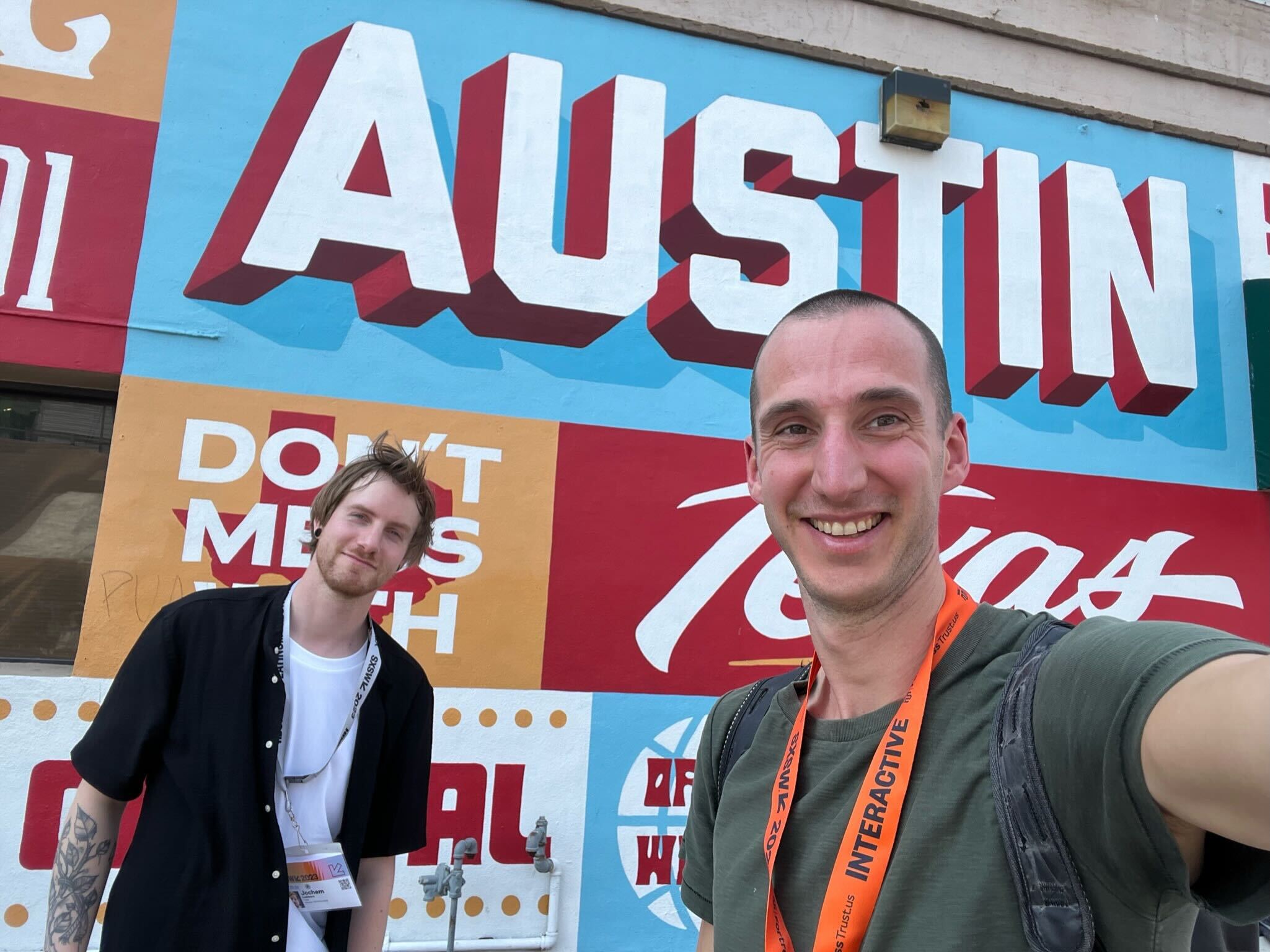
In this article, we look at the key aspects of what makes a good designer a great designer, inspired by talks of Design Matters 2023 Copenhagen.
Using “No” positively and getting “Yes” consistently
Like it or not, but influencing stakeholders is a crucial part of being a designer. Sometimes it seems near impossible to get a certain idea across, but there are methods that can help you improve in being influential. For starters, try to put yourself in your stakeholder’s shoes, understand the reason behind the “No” and work towards a common goal that benefits the whole team. Convince by engaging.
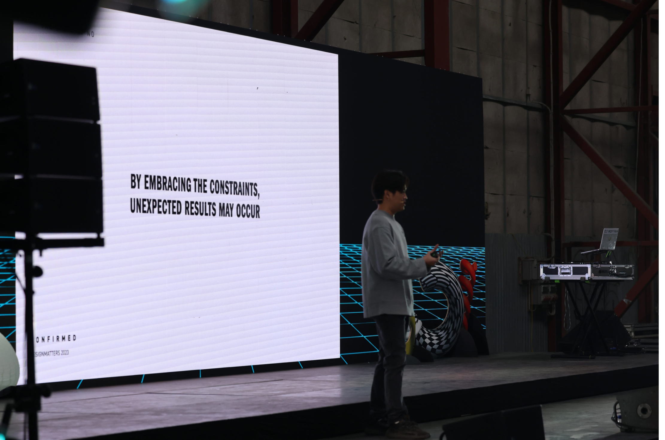
Photo by Design Matters
Design sprints
A great way to find this common goal is to let your stakeholders do the work, and give them the superpower to design. Include your stakeholders and let them know that their opinion matters and is being heard. Listen proactively, ask questions and circle back to them. A design sprint is a great way to collaborate and really get something done. Using design sprints can help the team get aligned and reach the finish line faster since there is less room for error and miscommunication. Google goes deeper into the design sprint methodology if you are interested in reading more about this way of working.
Do your user research
You've probably heard this before, but do your user research. How are users using the product? Who even are they? Now, as digital designers, we might not have the luxury of spending a lot of time on user research given the lack of estimated hours or just the complete absence of user research in the sales proposal. But we can do research in other ways as well. Benchmarks are a great way to identify great solutions. Exploring different UX/UI patterns across major platforms is an excellent source of inspiration. Mobbin.com offers a curated collection featuring a variety of apps and websites to spark your creative ideas.
For validating your new designs or ideas, you can explore different platforms like usertesting.com. These platforms offer a user-friendly way to test and validate your designs and ideas with real users. Getting feedback from the people around you is probably one of the best ways to get real, honest thoughts.
Creating hype
Another interesting way of influencing your stakeholders is creating hype around your product. Creating hype and trying to create a unique experience results in people wanting to be part of your product and ideas. For example, try organizing exclusive launch events and hand out merchandise. You can team up with your marketing to organize this.
On defeating self-doubt and getting confidence in your self-expression
Influencing is hard, but it’s a skill that can be learned. Embrace limitations. Discover together, ask better questions and inspire your stakeholders while guiding the way.
By improving how we communicate and showing the importance of our design decisions, we can create a common goal that our team can all get behind. Similarly, using design metaphors in UI is like telling a meaningful story. It can make the user experience a lot better.
For instance, the NRK Super app (The Norwegian Broadcasting Corporation) for kids uses a playful key and lock metaphor during its registration process, adding a fun element for young users. Combining this approach with interactive features like haptic feedback, intuitive gestures, and dynamic visuals can significantly enhance your app's appeal and usability.
Don’t be satisfied with your first iteration, go beyond!
Sometimes, when the stars are aligned, we designers get a clear briefing that is easy to follow. We ask for feedback after the first version and one or two iterations later, the interface is done. But we may not always feel satisfied after the final version. This can result in not getting much pleasure out of your work eventually, so how can you keep challenging yourself and get the most out of your designs?
Even the most mundane tasks can be made fun
Two UX designers from NRK Ida Håkonsson & Rebekka Valdmanis Mørken, Norway's national broadcaster, showed the different iterations of their sign-up flow for their NRK Super app, the kid's version of the NRK app.
The challenge for the sign-up flow was that the app was being used by children, but their guardians needed to approve creating the account somewhere within the flow. The speakers explained how guardians engage with their children after having a hard day at work, cooking a meal and cleaning the house. The last thing they want to do is go through another sign-up flow on their child's tablet.
NRK’s solution was to first intrigue the children with an overlay that showed 2 famous NRK characters, telling the child to insert a key in a keyhole. This action was meant as a metaphor for “logging in”, which is a vague concept for children. This is a pretty unique call to action instead of a standard button that children can’t read anyway.
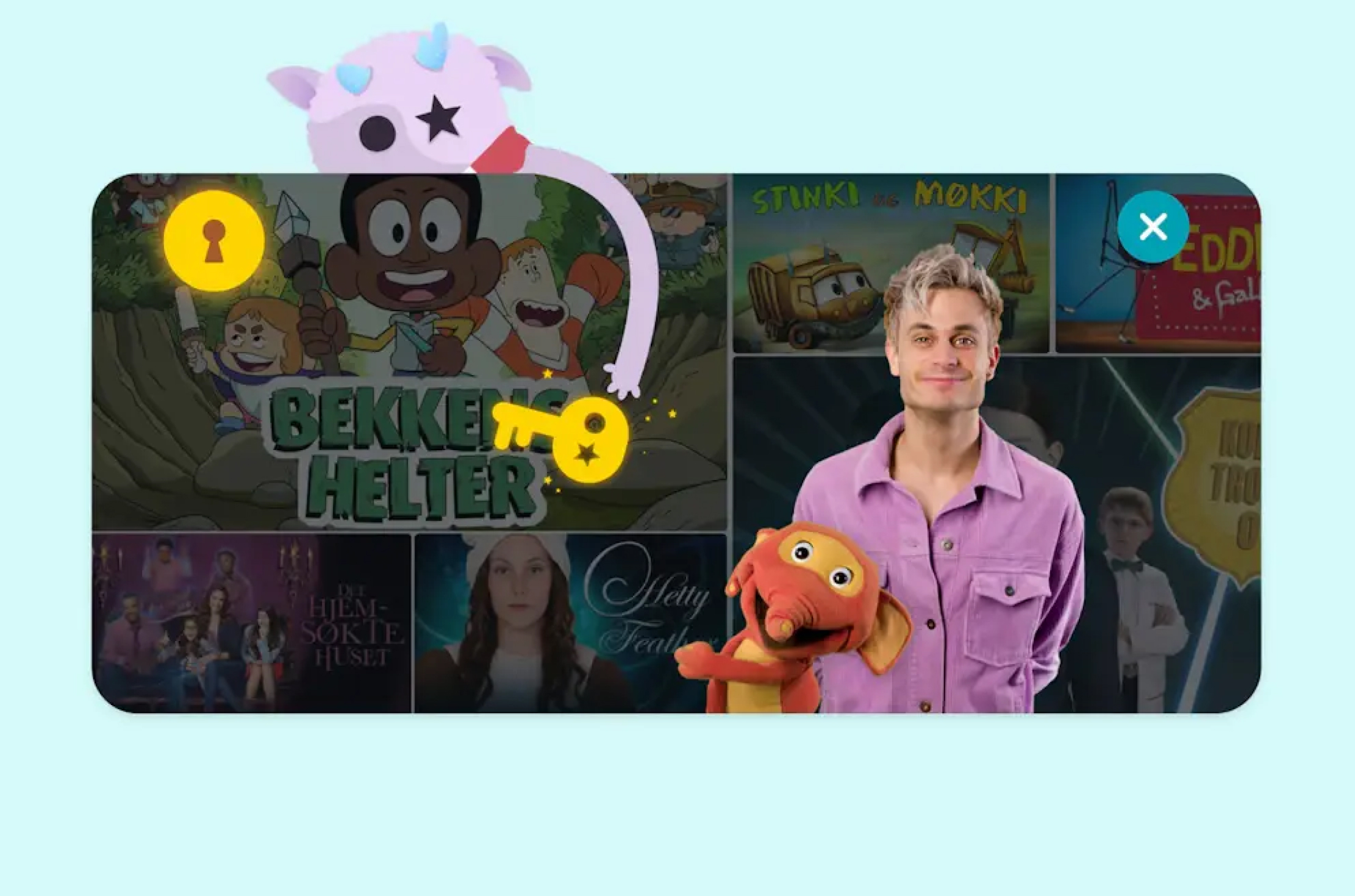
Photo by NKR
Unlocking the door is a known action for children, they have seen it in movies (think Alice in Wonderland), and have seen their guardians perform the action multiple times a day. They know that opening a door reveals something to them that they might not know about yet. In NRK's case, opening a door shows the sign-up flow that has been specifically tailored to cater towards young children and pre-teens.
Start the fun stuff
The NRK Super app starts the sign-up flow with “the fun stuff” and keeps the “boring part” as the final step of the sign-up process so that the guardians are only needed at the end and not throughout the whole flow. But what’s the “fun stuff” you may ask yourself? Character customization. Within the first step of the sign-up flow, you are free to select from a large range of different-looking characters that have their own adorable quirks. These have been created with NRK's wardrobe for different old and new shows in mind so that they are attractive to a wider range of users. They also look oddly and weirdly cute, with the NRK kids logo smartly inserted as the character's eyes. You could see a lot of thought has gone into this. The second step provides a content filter, where the child selects what shows they like.
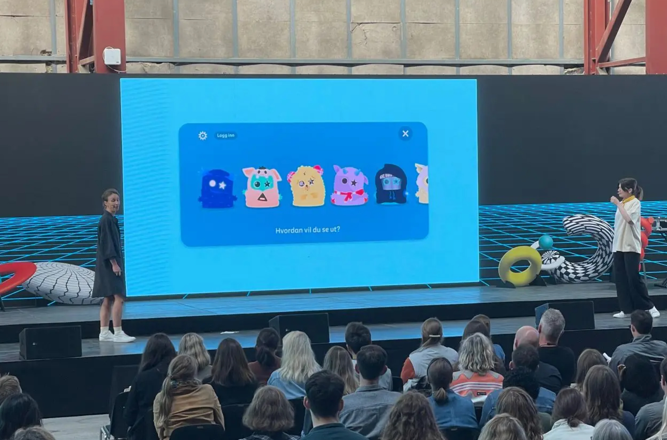
Photo by NRK
Making the profile as close to finished as possible and keeping the guardians approval as the last step, it’s harder for them to ignore all the work the child has put into setting up the profile so they are more eager to finish the “boring stuff” like filling in the name & email.
You probably already possess a unique design style
As a designer we mostly follow brand guidelines, but have you thought about owning your own style? Do you sometimes feel that you are being held back by certain branding or technical limitations? Chances are you already possess a unique style, maybe without even knowing.
Advantages of identifying your personal design style
Understanding your design style helps you align with your personality and will give your designs more character. Making the creative process more enjoyable and allowing you to track your progress more effectively. Moreover, it fosters consistency in your work, attracting clients who appreciate your distinctive art style and increasing the likelihood of being chosen for projects that resonate with your aesthetic.
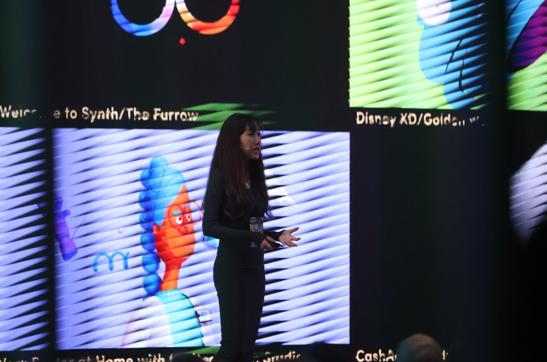
Photo by Design Matters
Ways of finding your unique design style
The art style you aspire to develop significantly determines the specific tools you must acquire and master. For instance, if your goal is to craft 3D objects or delve into illustrative designs, you will require entirely distinct sets of tools and skills.
Identifying your unique design style can be achieved by doing personal projects where you can express yourself. Try to make a schedule, like creating something each week or by joining online design challenges, such as Inktober. Keep in mind that what you may see as limitations in designing something, others may see as a unique art or animation style. Don't be a perfectionist.
Another way that can help you define your own style is to keep track of your work on a separate Instagram account. You can even keep your account private for a while if that’s what you like. But seeing your work evolve and spotting similarities that you do or don’t like, can help you fine-tune your own style.
Also, remember that your unique style doesn’t just radiate through design. You gravitate more towards certain furniture, fashion and lifestyles than others. Realizing what you like and what makes you you is a good starting point for curating your own design style. Maybe you like minimalist apartments, natural colours and simple high-quality clothing. Or maybe you love art, vibrant colours and like to keep up with fashion trends. Every person is different, so use that superpower when you’re creating.
Some key takeaways
- Get in the heads of your stakeholders, get them involved within the design process.
- Knowing your design style can lead to more enjoyable work, and clients that have more appreciation for your work.
- Using real live metaphors in UI design can create better stories and a more enjoyable user experience.
- A complicated solution is simple, a simple solution is complicated.
You are a badass!
You will still get No’s from stakeholders from time to time, there will not always be enough budget or time for the wonderful ideas you would like to explore within a concept. But, know that you are contributing to something great and you are important!
Slowly getting confident and steadily keeping practising how to influence people around you, can bring a lot of joy to your work and can help improve your designs. Try to think out of the box to achieve unique design solutions and involve the target audience to collect new insights, if there is time for it within the project. If not, no problem. Even the small things can make a huge difference, just a simple micro-interaction can make someone's day. Just know that your work might feel worthless at times, but everything you make is good practice, because you are becoming a better designer that will eventually help users, future generations and maybe even the world.

